Flow Analytics
Analyze and optimize your communication flows and customer journeys
The Analyse mode of Webex Connect Flow Builder provides you the ability to analyze the performance of your published flows at every node. The Analyse mode provides an aggregate view of the execution counters at every node, enabling you to analyze the flow traffic and make necessary changes as per the customer interaction patterns. The data is refreshed every 15 minutes.
Enabling 'Flow Analytics' for your tenant
Flow Analytics is an add-on feature. Reach out to your account manager if you would like to enable it for your account.
Switching to Analyse Mode
Once flow analytics has been enabled for your account, the Analyse tab will be visible next to the
Build tab within the flow builder. You must republish the flows (i.e. made live again) to start seeing the execution details.

Switch Modes
Using Analyse Mode
Once you switch to the Analyse mode, you'll see the last published version of your flow in a view-only mode. In this mode, you can view the execution counters and duration metrics for each node within the flow.
Here's how it works:
- Select a specific version of the flow (execution stats will be available only the versions that are published after enabling flow analytics)
- Select the relevant time period (performance of different flow versions need to be analyzed individually)
- Analyze the progression of transactions for partial/complete flows
- Use zoom in/out and pan controls to move around the flow on the flow canvas.
The Analyse mode also provides an insight into the successful transactions and drop-outs caused due to errors or failures at each node – both incoming and outgoing. It lets you observe the flow performance and modify the flow based on usage patterns and errors if required.
You can analyze the execution stats only for the flows that have been published after enabling flow analytics. When you attempt to analyze a draft flow, the platform automatically loads the last published version of the flow.
You can see the notes attached to the flow or individual nodes in the Analyse mode.
Execution Counters
You can view the aggregate of execution counters for each of the nodes. You can see the node execution counter at the upper-left corner of the node. The node count is a cumulative count of incoming counts from multiple nodes. For example, if node 3 has inputs from node 1 and node 2, then the count of node 3 is a cumulative count of executions from node 1 and node 2.
The counters also appear on the connectors between the nodes. The connector counter indicates the number of transactions that have passed from the previous node to the following node.
When you hover over any node outcome, you can see the node outcome counter of that outcome.
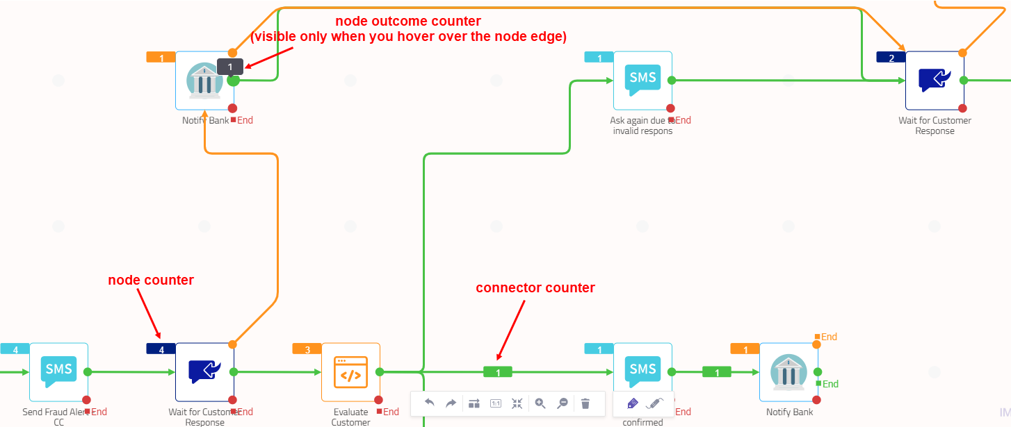
Counters on Nodes and Connectors
Flow Average Execution Time
The flow average execution time appears beside the date range picker. The average time is dynamically calculated as per the date and time you select.
Execution Time
You can see the Execution Time toggle button at the bottom of the flow builder in the Analyze mode. When you turn on this toggle button, you can see the average node execution time in the flow builder in analyze mode.
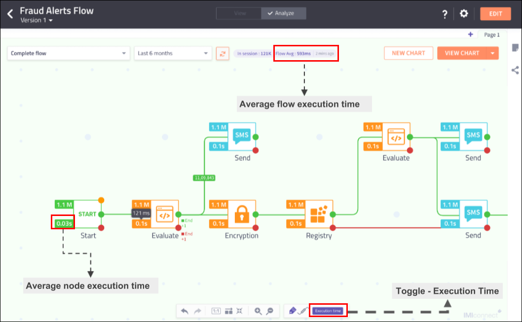
Average Flow Execution Time
Duration Metrics
The duration metric is the average execution time taken by the node for a date and time that you have specified.
Version Selector
You can select the version of the flow for which you want to analyze the transactions and performance. To select a version, click the drop-down list box available at the upper-left corner of the flow canvas and select the required version. When you select a version, you can see the date range within which that version was live.
Date Range Selector
You can select the date range that suits your requirement to view the aggregate counters of flow executions initiated in that time range. When you select a version, the date picker shows the live dates of that version, and you can select any date in that range. The date picker also provides an option to select the time range using the time picker. The platform defaults the time to the current system time.
Date and Time Range Selector
If you select a date range outside of the version live dates, an error is shown within the date range selection box and you are forced to select either the live dates of the version or any date range in between. You can click the Apply button only when you select the dates within the version live dates.
Version Specific Counters
You can select the required version of the flow to:
- view the execution counters specific to that flow version
- analyze the flow which includes execution counts, node selection, flow sharing, and Sankey charts.
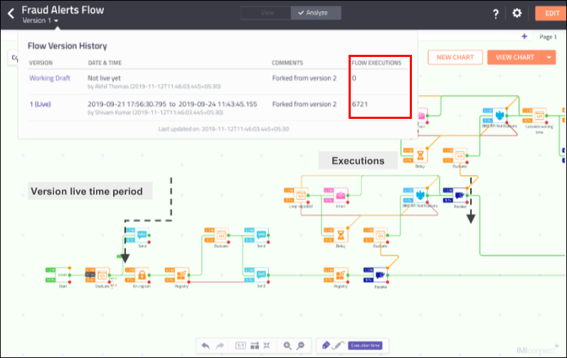
Select Version
For the flows which are already live, you will see the data from the time point when flow analytics is enabled.
Refresh Button
The Refresh button allows you to refresh the counters at every node and reload the flow. The counters are refreshed at an interval of 10 mins hence the details for flows executed recently make take some time to reflect.
Refresh the Flow
You must refresh the flow explicitly when you select a different date or date range so that the changes are applied.
In-session Counters
This counter displays the aggregate number of sessions in the flow, which are not completed yet.
Last Refresh Timestamp
This field located at the top of the flow canvas shows the time when the counters were last updated, that is the last refresh time of the flow.
Search Option
You can search for a node in the chart by typing the node name in the search bar. When the node name is clicked from the list, the chart is zoomed to the node.
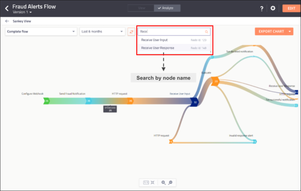
Search in Sankey Chart
User View Settings
The User View Settings icons let you choose if you want to display the node labels and connector labels on the flow canvas. The buttons at the bottom of the flow canvas allow you to toggle between displaying/hiding the labels. By default, the node labels are visible and connector labels are hidden.
The toggle buttons appear in blue indicating that the labels are turned on and are visible on the flow canvas.
Node and Connector Labels Off
Share Flow Settings
You can generate a shareable link for flow and share the flow with other users. Anyone with the link can view the flow. Users who view the flow can see it in a view-only mode.
You can decide if you want to include/exclude the Analyse mode in the flow that you share. When you include the Analyse mode, all the execution counters along with the Sankey charts become part of the shared flow.
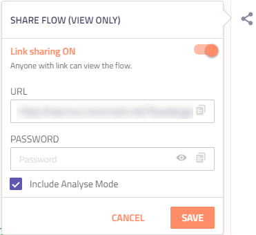
Share Flow Settings
Sankey Charts
A Sankey chart provides a visual illustration of data and transaction flow from one node to another. The width of each node on the chart is proportional to the quantity of that node. Click View Chart directly to see the Sankey chart for the complete flow.
You can generate a Sankey chart even for a segmented flow. A segmented flow is a partial flow that contains only the nodes that you consider important for the business outcome.
The nodes on the Sankey chart are aligned with the node positions on the flow canvas.
We recommend you to build flows progressively to get better understandable Sankey Charts.
Select Nodes
All the nodes are greyed out by default. When you hover on any node, the node boundary is highlighted depicting that the node is available for selection. When you haven't selected any nodes yet, you will see the following message on the screen:
Select two or more nodes on which you would like to analyze transactions.
When you select a node, the analytics engine automatically includes all its connectors as part of the selection so that the input and output data of the node is also available. The user interface highlights the nodes that precede and succeed the selected node, indicating that they are available for the next selection. This enforces a sequential selection of the nodes.
Node Selection
For example, if you select the WhatsApp node as shown in the above screen, the connectors to and from this node are highlighted and the respective input and output nodes for the node are available for selection.
Generate New Chart
To generate a new chart:
- Click the New Chart button located at the upper-right corner of the flow canvas.
- Select at least two nodes that you want to use for analyzing the transactions.
The chart is temporarily saved with the name New Chart and indicates the number of nodes selected for generating the chart until you explicitly save it.
- Click Save Chart.
- Provide a name for the chart and then click Save.
The saved chart appears in the drop-down list box located at the upper-left corner of the flow canvas.
Saved Charts
You can see the name of the user who has created the chart along with the timestamp. You can also delete, edit (update the name of the chart), or view the chart using the icons available next to the chart name.
View Chart
When you select nodes that you want to include in the Sankey chart, you can directly view the chart before saving it. To view a saved chart:
- Select the required nodes and click View Chart.
View Chart Button.
- Alternatively, you can also click the name of the chart from the drop-down list box of available charts located at the upper-left corner of the flow canvas.
The Sankey chart appears:
Sankey Chart
Export Sankey Chart
When you view a Sankey chart, you can export it using the Export Chart button located at the upper-right corner of the screen. You can export the chart to any of the following formats:
- SVG - the chart gets exported as an SVG file with node and connector labels
- PNG - the chart gets exported as a PNG image with node and connector labels
- CSV - the chart gets exported as a comma-separated file and contains fromnodeid, tonodeid, fromnodename, tonodename, and value as the columns of the worksheet. The footer information contains flow name, flow version, chart name, and date selection.
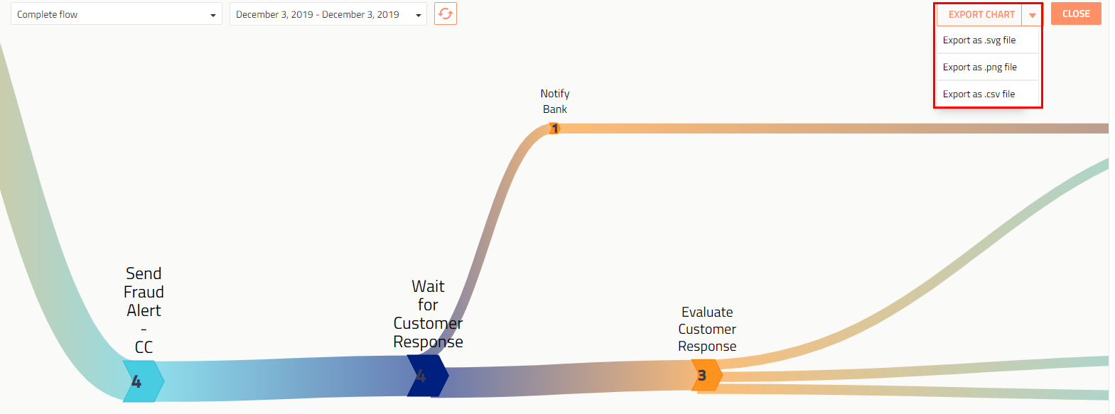
Screenshot of Export Options for Sankey Chart
View Sankey Chart in Reports
When you navigate through the workflow reports for a specific workflow, you can see the report in the form of a Sankey chart. See the Reports section for more details.
In the Sankey View, a list of saved Sankey charts for each version of the selected workflow appears in the Sankey View pane. Select an entity, a workflow, and the Report Type as Sankey View. Now select the version of the flow for which you want to see the Sankey chart and click View Charts.
Sankey Report
The Sankey View report type appears only if Flow Analytics has been enabled.
The following image displays a sample Sankey chart report for a workflow.
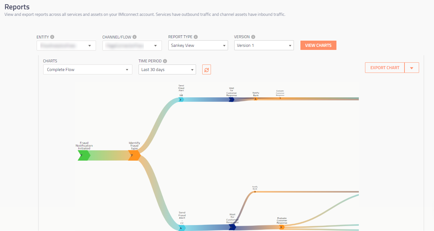
A Sample Sankey Chart Report
Updated 15 days ago
