
Learn how you can create and manage Email message templates.
Webex Connect offers an intuitive drag and drop email composer to configure email templates. Webex Connect supports two types of email templates:
Full Templates - A single email template comprising all key email components including header, body, and footer.
Partial Templates - Multiple partial templates can be combined to form a complete template. This feature is useful when you want to configure multiple email templates with common elements. E.g., A logistics company may have a series of email templates to inform customers about the order status at various stages. Typically the header and footer of all these emails will be the same while the body content will vary for each email template. Partial templates feature can be used in such situations by configuring partial email templates for each of the email header, email body, and email footer. These parts can be combined at run time to create full emailers.
- Partial templates are reusable blocks that you can use across various emails.
- Any change made to a partial template applies to all the emails that use the partial template.
- Webex Connect allows you to Test partial email templates by clicking on the action dropdown for partial email templates under Tools -> Templates section. Once clicked, you will be able to select anywhere between two to ten partial email templates and test them in combination. Partials will be rendered in the order of selection.
Configure a New Template
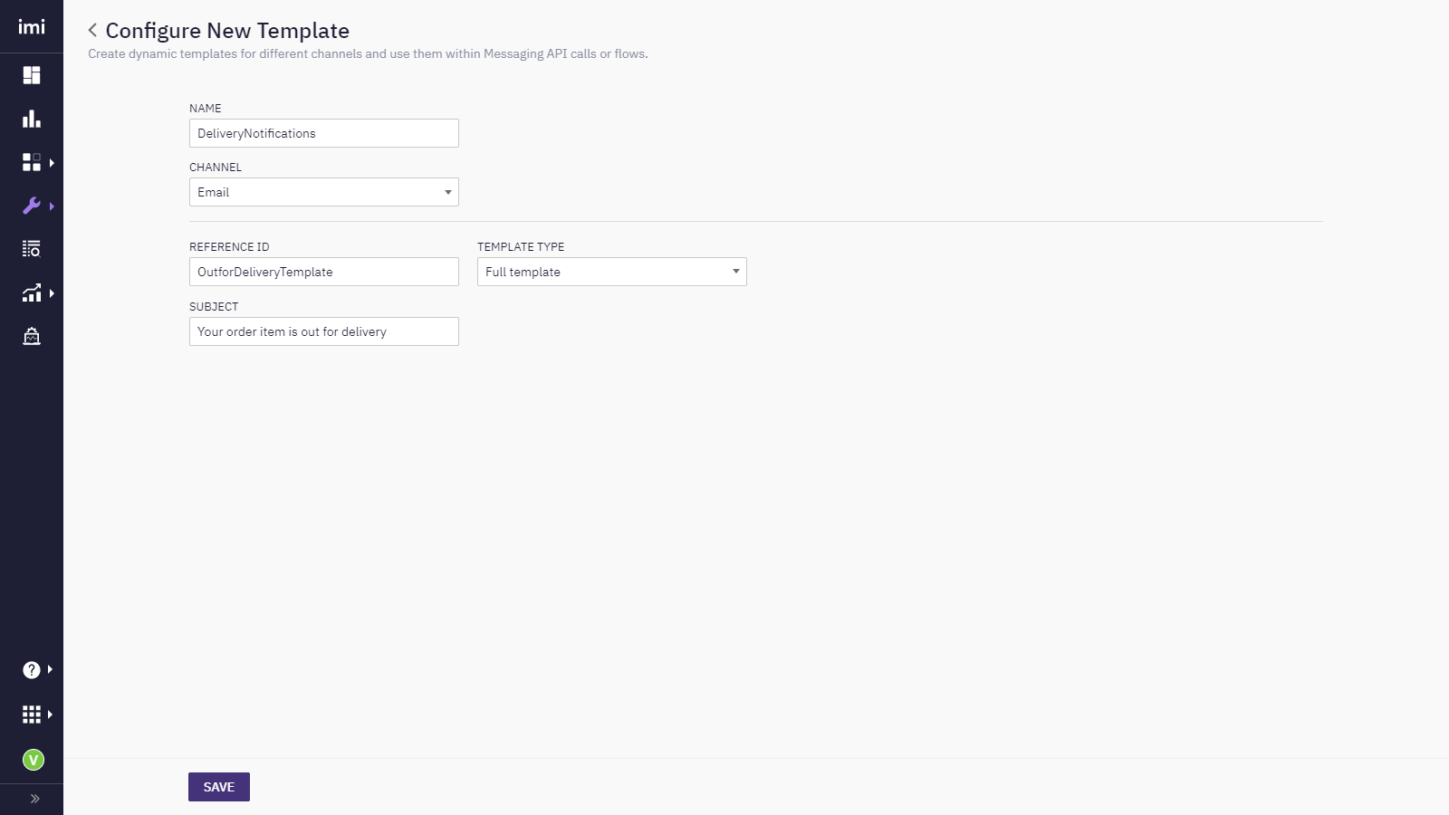
Steps to configure a new email template:
-
Go to Tools > Templates.
-
Click Add New Template.
-
Enter a Name for the template. Only lower case letters and underscores are allowed in this field. Do not use spaces in the template name.
-
Select the Channel as Email.
-
Enter a Reference ID for the template. For example, Brand Marketing. This can be used to reference the template in Send Email node when using Dynamic Template selection option.
-
Select the Template Type - Full Template or Partial Template.
-
Enter a Subject for the template.
Creating a New Email Template
-
Click Save.
Email Subject
The character limit for Email Subject Lines in a template is 998 characters.
-
Click Save & Next. The Email Composer screen appears.
Email Composer
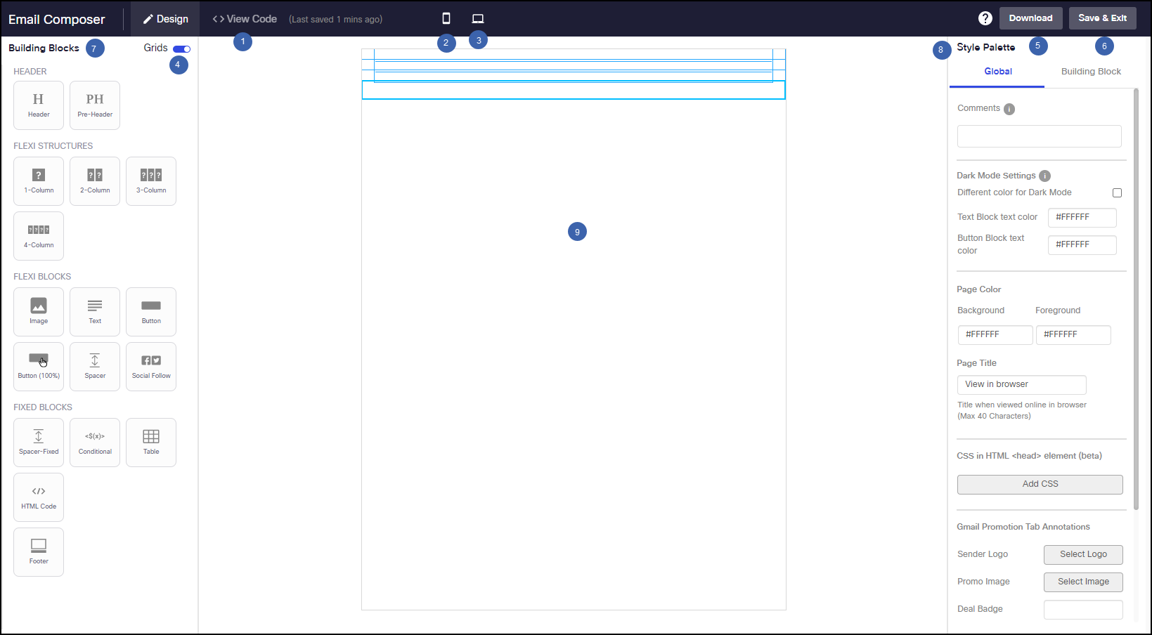
Feature Description 1.HTML View To view the HTML code of the composed Email template. 2.Mobile View To view how the composed email template will look on a mobile device. 3.Desktop View To view how the composed email template will look on a desktop device. 4. Grids To view the margin, paddings and outline of the building blocks. 5.Download To download the composed email template in HTML format. 6. Save & Exit To save the email template design and close the composer screen. 7. Building Blocks It contains all the building blocks to design a email template. 8. Style Palette It contains all the style elements that can be used to change the properties such as margins and paddings,borders,background colour for building blocks and page background. 9. Design Canvas It is the work area that holds the design of the email template. -
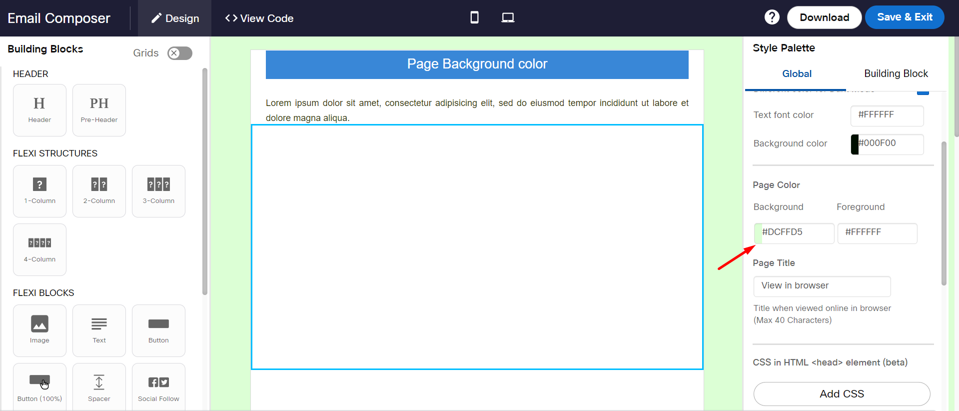
On the Style Palette, click on the Global tab. Set the required colors to apply background color for a page and a default background color for all Building Blocks.
Applying Background Colour using Style Palette
-
From the Building Blocks palette, drag-&-drop the required block on the workspace. For more information, see [Building Blocks](#building Block Options) section.
Building Blocks
-
On the Style Palette, click on Global tab and apply colors for page background and foreground. Click on the Building Block tab to apply styles to selected individual building blocks.
-
Dark Mode Settings: Use the Dark mode for text colour, text, blocks, etc.
-
Background: Use this option to set a background color for the page.
-
Foreground: Use this option to set a default color for all building blocks. When a new block is added to the workspace, the selected background color will be applied automatically.
-
Page Title: Use this option to enter the meaningful text that is displayed on the browser tab when the email is viewed on a desktop browser.
Style Palette
The text of the Page Title will be displayed on the browser:
Page Title
-
-
When a text is selected in any building block, a toolbar is displayed to apply font type, text size, text color, text alignment, text height and so on. You can also add a URL to a highlighted text.

Text Toolbar
Note
$(x) button on the toolbar is not operational, but it does accept manually entered values.
-
For Image building blocks within the style palette, you can select an image or add a link for Desktop and Mobile devices.
-
Click Save & Exit to save and close the email composer screen. The system auto-saves the content every 2 minutes.
-
If you want to close the template without saving the changes, click on x. When you open the template again, the system will give you the option to retrieve the unsaved changes or open the template in its last saved version.
Building Block Options
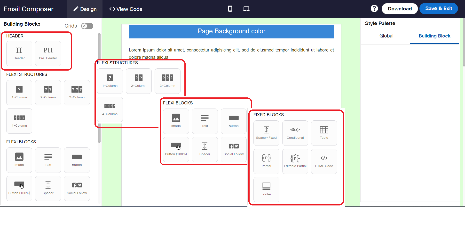
The building blocks are grouped based on their similarity under different accordions. Every block has a copy, copy code to clipboard, move, and delete options.

Building Block Options
Manage unsubscribe link in an email
- Open the email composer.
- Click Add Layout. The Layout Palette is displayed.
- From the Layout menu, drag and drop the Footer element on the canvas.
A text block with default text with a unsubscribe hyperlink is displayed. - Click on Unsubscribe text; the rich text toolbar is displayed.

- On the toolbar, click insert link icon to configure the Unsubscribe hyperlink.
- Enter the hyperlink details. and click OK.
You are done with unsubscribe link creation.

Screenshot of adding the Link
| Label | Description |
|---|---|
| URL | Enter the URL of the hyperlink. This URL will open when a user clicks 'unsubscribe' in the email. |
| Link display text | This is the hyperlink text in the email. |
| Mouseover text | The text to display when the user hovers the mouse on the hyperlinked text. |
Add Layout (Palette)
The Layout Palette interface enables you to design a template by a simple drag and drop interaction. You can edit images and content with the help of an inbuilt editor. Following are the template elements and cards available in the layout:
| Element | Description |
|---|---|
| Pre-Header | A preheader is the short summary text that follows the subject line when an email is viewed in the inbox. |
| Header | Allows you to add an introductory content. |
| Spacer | Allows you to add a space between two elements. Click the spacer element on the canvas to open the Style Palette. |
| Button | Allows you to place a clickable button. Double-click the button element to configure the button. |
| Button & Text | Allows you to add a button (in the right) and a text box beside the button. |
| Text | Allows you to add a paragraph text. |
| Conditional | Allows you to create a conditional email based on the conditional criteria with the help of a conditional builder. Please note that you cannot add more than 120 IF/ELSEIF conditions within an Email Template. |
| Table (Textual) | Allows you to add a table to the template. |
| Image | Allows you to add an image. The image is justified to the content on the template. |
| Image(100%) | Allows you to add an image. This image occupies the total width of the template. |
| Image & Text (15:85) | Allows you to add image and text. The image occupies 15% of the width and the text 85% of the width. |
| Image & Text (30/70) | Allows you to add image and text. The image occupies 30% of the width and the text 70% of the width. |
| Image & Text (50/50) | Allows you to add image and text. The image occupies 50% of the width and the text 50% of the width. |
| Text & Image (50/50) | Allows you to add text and image. The text occupies 50% of the width and the image 50% of the width. |
| Image & Text | Allows you to add an image and a caption to the image. |
| Two Images & Text Group | Allows you to add two images, a header, and text to each image. |
| Three Images & Text Group | Allows you to add three images, a header, and text to each image. |
| Two Images Group | Allows you to add two images side to side as a group. |
| Three Images Group | Allows you to add three image side to side as a group. |
| Social Follow | Allows you to add text and image, configure link for social media sharing. |
| Divider | Allow you to add a divider(horizontal space ) between two elements. |
| Footer | Allows you to add footer to the email. |

Screenshot of Building Blocks in the Email Composer
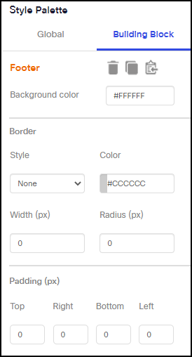
Style (Palette)
The Style Palette enables you to customize and format the elements blocks and cards used in the canvas area.
| Element | Description |
|---|---|
| Background Color | Allows you to set the background color of the text. Note: This option is displayed on selecting a text element. |
| Image Style | Allows you to set image style (i.e Height in pixels and width in percentage) Note: This option is displayed on selecting an image element. |
| Border Style | Allows you to set the width, radius, and color of the selected text. |
| > Border width | Drag and drop to set the border with of the text box |
| > Border Radius | Drag and drop to set the radius of the text box |
| > Border Color | Allows you to set the border color of the text box |
| > Border Style | Allows you to set the border style. Choose a style from the dropdown. |
| Padding & Margins | Allows you to set the margin and paddings for the text. |
| > Padding top | Drag to set at the text padding above the text. |
| > Padding right | Drag to set at the text padding-right to the text. |
| > Padding bottom | Drag to set at the text padding below the text. |
| > Padding left | Drag to set at the text padding-left to the text. |
| > Margin top | Drag to set the top margin of the element |
| > Margin right | Drag to set the right margin of the element |
| > Margin bottom | Drag to set the bottom margin of the element |
| > Margin left | Drag to set the left margin of the element |

Screenshot of Style Palette on Email Composer
Source Mode
In this mode, you can enhance or modify the HTML code that may have come from an external party. It helps the user customize the templates that cannot be done in graphical mode. All the edits in the source mode can be previewed, cleared, viewed, or saved.
Click the Toggle Switch to enable/disable the code window.

Screenshot of HTML View on Email Composer
Updated over 1 year ago